Amazing Book Covers to Inspire You


Never judge a book by its cover.
Ha, I’ve never heard anything that’s less true. I guess the origins of the phrase suggest you shouldn’t judge people by outward appearances or something like that, and yes, that’s definitely true.
But when we’re talking about actual books, then you should absolutely, definitely be judging books by their covers.
Publishers use book covers as marketing tools. It tells you, dear reader, where that book falls in terms of genre and age and lets you know if this might be a book you like.
If you’ve ever wondered why all the books in a specific category look similar, that’s on purpose. It’s a sign post. A guide that says, if you like other books in this genre, then this book might also appeal to you.
And if you’re writing and publishing your own books, the same is true. Say it with me: a book cover isn’t an expression of your creativity—it is a marketing tool that tells your reader what to expect between the pages and making it similar to other books in your genre is a good thing. Sure, there are successful books with covers that deviate from genre expectations, but those are few and far between. If you’re trying to come up with an extremely unique, extremely different book cover, all you’re doing is creating an uphill battle for yourself.
So what makes for a good book cover? Well, being on-genre is just a start. It’s also imperative that you combine color, imagery, text, and composition in a way that is easy to read, eye-catching, and of course, helps sell that book. And trends change over time. What was in a few years ago might not be what’s selling now.
So let’s look at a whole bunch of top-notch covers from some bestsellers that were published in the past few years (because remember that trends change all the time) and examine why they work.
Fantasy and Science Fiction
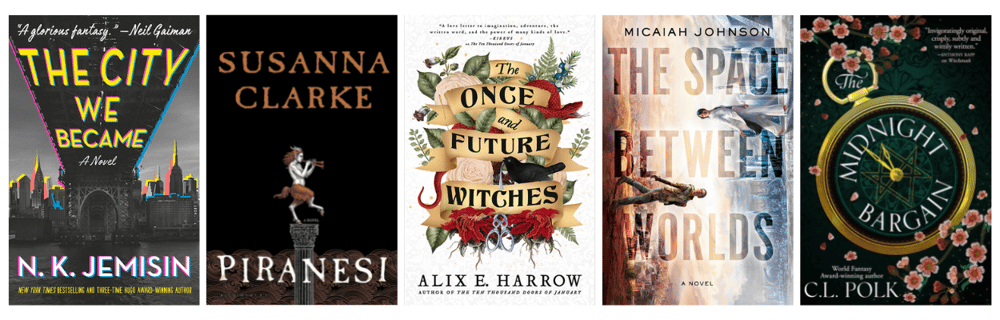
Adult fantasy and science fiction books rely mostly on an intricate combination of large text and symbolism to convey genre, as you can see from the list here.
- The City We Became by N.K. Jemisin features a stunning, surreal image of New York City bursting with life and color. This cover captures the novel's urban fantasy premise of cities coming to life as beings with personalities and powers, and the bold and bright typography adds a sense of urgency.
- Piranesi by Susanna Clarke includes an intricate, beautiful image of an otherworldly palace, filled with details that hint at the novel's themes of mysteries and impossible architecture. The color palette is dark and dreamlike, giving the cover a haunting, almost melancholic quality.
- The Once and Future Witches by Alix E. Harrow offers a folk art-inspired image evoking the novel's themes of sisterhood, magic, and nature. The use of bold, bright colors and playful designs makes the cover feel both contemporary and timeless.
- The Space Between Worlds by Micaiah Johnson features an image of two people walking towards each other in a vertical orientation, which captures the novel's premise of multiple universes and the idea of overlapping realities. The typography is simple but striking, making it easy to read.
- The Midnight Bargain by C.L. Polk features a golden clock that represents the ticking of time and the urgency of the protagonist's quest to secure her future through a successful magical bargain. The use of muted colors and intricate details makes the cover feel both lush and elegant, like the book’s setting.
Literary Fiction
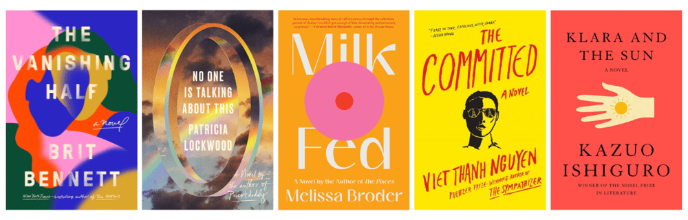
The literary fiction genre also tends towards typography and symbolism, with the occasional simple illustration, but with brighter color palettes and simpler designs.
- The Vanishing Half by Brit Bennett gives a striking, minimalist image of two women with contrasting skin tones, which perfectly captures the novel's themes of race, identity, and family. The use of negative space and simple typography gives the cover a sense of elegance and sophistication.
- No One Is Talking About This by Patricia Lockwood features a single gold ring, representing the themes of disconnection and hyper-connectivity in the digital age. The use of bold typography captures the tone of the book.
- Milk Fed by Melissa Broder shows us a playful image of a round object that could either be a donut or a breast, representing the themes of indulgence and pleasure-seeking. The use of bright colors creates a sense of whimsy and humor, while also conveying the book’s serious themes of body image and identity.
- The Committed by Viet Thanh Nguyen features a half-obscured image of the novel's protagonist, a Vietnamese man who is a former communist spy and drug addict living in Paris. The use of bold typography and minimalist design creates a sense of power and urgency, conveying the book’s themes of rebellion and resistance against colonialism.
- Klara and the Sun by Kazuo Ishiguro has a minimalist image of a hand with a glowing sun, representing the themes of artificial intelligence and human connection. The use of bold typography and subtle design creates a sense of mystery and intrigue.
Contemporary Romance
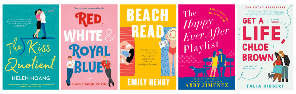
Rom-coms are known for their cute cartoon covers that use bright colors and bold typography to convey the genre accurately, even when the subject matter can be quite serious.
- The Kiss Quotient by Helen Hoang features the East Asian protagonists kissing on top of a division sign, and embodies the themes of romance, intimacy, and neurodiversity. The scripted font gives the cover a whimsical appeal.
- Red, White & Royal Blue by Casey McQuiston shows off the two main characters—a British prince and the son of the President—capturing the book’s political intrigue, secret romance, and queer representation. The use of bold colors and a quirky, irreverent design sensibility give the cover a sense of energy and charm.
- Beach Read by Emily Henry depicts a lighthearted scene of two people sitting on a beach, which captures the novel's themes of summer romance, self-discovery, and creative inspiration. The use of bright colors and a handwritten font give the cover a fun, relaxed vibe.
- The Happy Ever After Playlist by Abby Jimenez shows the main couple on a park bench along with a dog, which highlights the novel's themes of unexpected love, second chances, and the joys of pet ownership. The use of bright colors and a playful design sensibility makes the cover feel upbeat and energetic.
- Get a Life, Chloe Brown by Talia Hibbert features an image of the multi-racial couple featured in the book and is used to highlight the novel's themes of self-discovery, healing, and building new relationships. The use of warm colors and a soft, romantic focus gives the cover a dreamy, almost fairy-tale quality.
Thriller
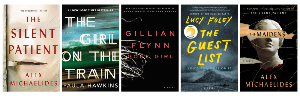
Thrillers rely on simple cover design with bold text and minimal use of images or symbols.
- The Silent Patient by Alex Michaelides features a haunting, enigmatic image of a woman's face with her eyes closed and mouth torn away to highlight the novel's themes of mystery, suspense, and psychological trauma.
- The Girl on the Train by Paula Hawkins boasts an atmospheric image of a train moving through a dark and blurry landscape to show the novel's themes of obsession, deceit, and danger. The use of bold typography and a gritty design sensibility give the cover a sense of intensity and urgency.
- Gone Girl by Gillian Flynn’s simple cover features bright text and a wisp of hair, like a woman fleeing, that captures the novel's themes of deception, manipulation, and revenge.
- The Guest List by Lucy Foley includes a moody image of a stormy night on an island with a shadowy figure in the foreground. This keeps it in line with its themes of secrets, lies, and murder. The use of bold typography and a textured design give the cover a sense of tension and drama.
- The Maidens by Alex Michaelides features a bust of a classical statue with her eyes covered. This image highlights the book's themes of obsession and murder, and its nod to mythology.
Mystery
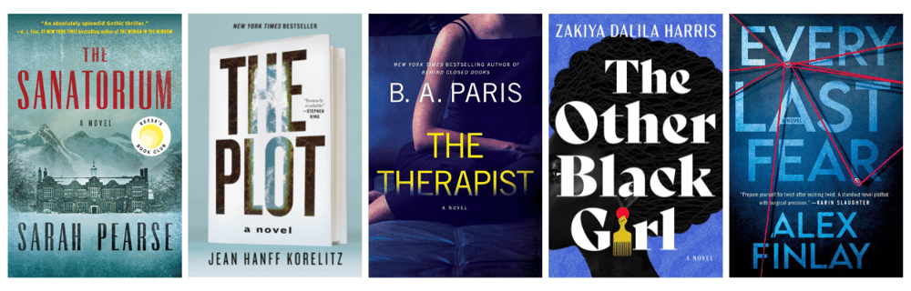
Mystery covers combine bold text, muted colors, and some imagery to convey the ideas of intrigue and tension you’ll find in a good mystery novel.
- The Sanatorium by Sarah Pearse features an image of a snow-covered sanatorium-turned-resort with a foreboding, darkened entrance, emulating the themes of isolation, danger, and intrigue. The use of minimalist design and bold typography give it a sense of tension and unease.
- The Plot by Jean Hanff Korelitz uses a clever design to create a book cover within a book cover, highlighting its themes of creativity, plagiarism, and revenge.
- The Therapist by B.A. Paris makes use of an image of an obscured woman’s body to channel the novel's themes of secrets, betrayal, and obsession. The use of bold typography that fades at the bottom helps to heighten the sense of intrigue.
- The Other Black Girl by Zakiya Dalila Harris uses an image of a black woman with an afro and sunglasses with bold, colorful typography to show the novel's themes of race, identity, and power. The use of vibrant colors and bold typography give the cover confidence and strength.
- Every Last Fear by Alex Finlay uses a simple image of a red string that is twisted and tangled together, conveying the twisty nature of this story, as well as the tension you’ll find between its pages.
Historical Fiction
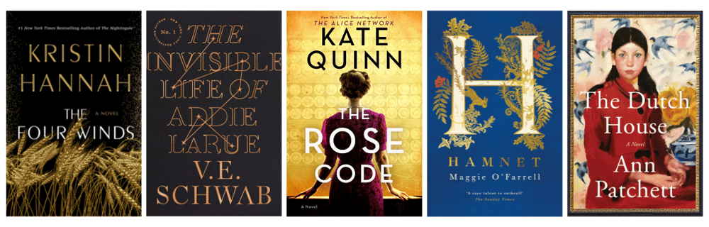
Historical fiction covers are more ornate than some of the previous genres we’ve discussed, using more flourishes, as well as decorative text and images to set the tone of these novels. They still use mostly muted colors, though, which I guess makes sense since historicals are typically more serious in tone.
- The Four Winds by Kristin Hannah, about the Great Depression, features stalks of wheat blowing in the wind to symbolize the novel’s themes of resilience, perseverance, and love during those difficult years. The use of muted colors and a minimalist design give the cover a sense of nostalgia and poignancy.
- The Invisible Life of Addie LaRue by V.E. Schwab has a simple cover design that includes the title written in a cursive script, giving the impression of something elusive and difficult to pin down, which is fitting for a book about a woman who can't be remembered by anyone she meets.
- The Rose Code by Kate Quinn features a woman in a red dress looking away, which helps convey the mystery and elegance of this book’s tone.
- Hamnet by Maggie O'Farrell makes use of a stylized “H” to represent the main character, Hamnet, who is Shakespeare’s son. The bold image gives importance to the protagonist’s connection to one of the most famous figures in history.
- The Dutch House by Ann Patchett features the main character on the cover done like a painting, where the brush strokes help give the cover depth and texture, much like the novel's tone and themes of complex and troubled family dynamics.
Young Adult Contemporary
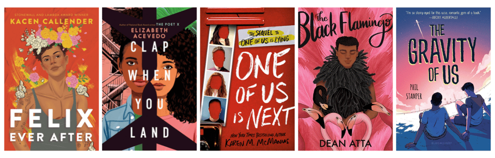
Now we move on to young adult book covers, which, of course, need to appeal to younger readers (while also drawing in adult readers, too). Young adult covers often feature images of the protagonist, along with bright colors and bold fonts to capture attention.
- Felix Ever After by Kacen Callender features a colorful image of a person with a painted face and butterfly wings that represent the novel's themes of self-discovery, love, and identity. The vibrant colors give the cover a sense of energy and optimism.
- Clap When You Land by Elizabeth Acevedo depicts an image of two planes over the faces of two girls to symbolize the book’s themes of family, loss, and forgiveness.
- One of Us is Next by Karen M. McManus includes a row of school photos with the kids' faces blotted out to convey secrets, revenge, and betrayal. The handwritten typography offers a bit of tension and suspense.
- The Black Flamingo by Dean Atta features the main character wearing feathers and standing amongst flamingos to show themes of identity, self-expression, and belonging.
- The Gravity of Us by Phil Stamper depicts two young boys looking away and into the distance to convey the ideas of love, family, and the challenges of following your dreams.
Young Adult Fantasy
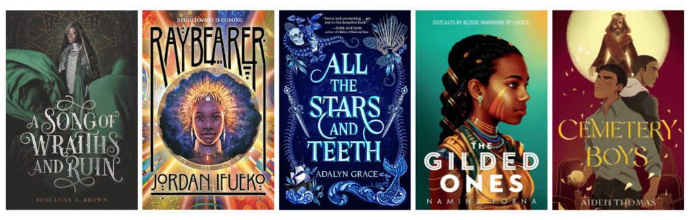
Much like YA contemporary, YA fantasy also uses bright colors and often illustrations of the main character on the cover. Covers tend to me more ornate, with shiny details to show the fantastical nature of these stories.
- A Song of Wraiths and Ruin by Roseanne A. Brown features the main character and uses warm colors and intricate details to give the cover a sense of magic and mystery.
- Raybearer by Jordan Ifueko depicts a fierce-looking female warrior, with colorful designs surrounding her, giving her an otherworldliness that fits the tone of the novel.
- All the Stars and Teeth by Adalyn Grace deviates a little with a text and symbol cover that conveys the ocean and deep sea setting of the book, along with the nautical blues to continue that idea.
- The Gilded Ones by Namina Forna includes an illustration of the book’s main character. She’s looking away from us with a fierce expression, creating a sense of power and strength.
- Cemetery Boys by Aiden Thomas features the main character and the story’s love interest, back to back with mystical elements surrounding them, which illustrates the book’s sense of mystery, love, and magic.
Middle Grade
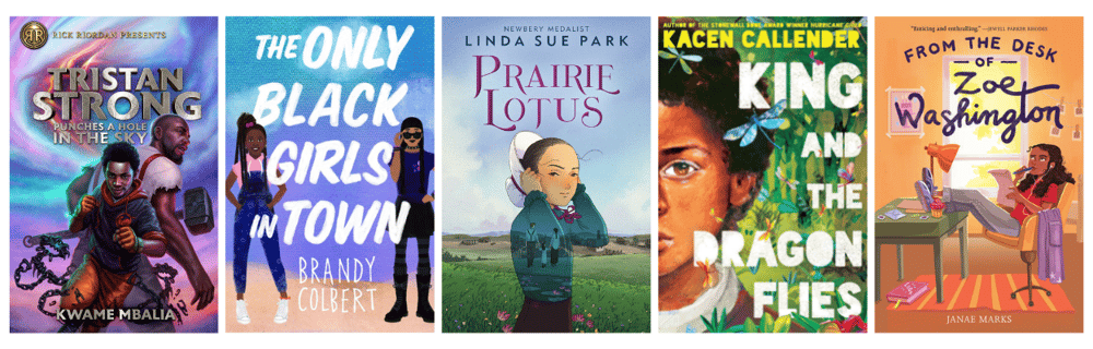
Middle grade fiction—targeted at readers in the 10-12 age range—also tends to feature depictions of the main characters, along with bright colors and bold typography.
Tristan Strong Punches a Hole in the Sky by Kwame Mbalia features an image of a young boy and an older man standing behind him holding a hammer. The bold colors and dynamic typography create a sense of action and adventure, echoing the themes of the novel.
The Only Black Girls in Town by Brandy Colbert depicts the two young girls featured in the book, using bright colors and bold font to capture the book’s themes of community and finding yourself.
Prairie Lotus by Linda Sue Park features an image of a young girl standing in a field, with a sprawling landscape in the background. The use of earth tones creates a sense of beauty and harmony with nature.
King and the Dragonflies by Kacen Callender makes use of illustration, depicting the story’s main character with dragonflies surrounding him. This all works together, along with the bright colors, to create a sense of magic and wonder.
From the Desk of Zoe Washington by Janae Marks once again depicts the main character, done in a whimsical illustration style, along with objects that are representative of the themes of the book. The bright colors are eye catching to draw in the younger audience.
If you enjoyed this article, then we publish ones just like it every week over at DabbleU. Each one is intended to help you learn more about the writing, publishing, and marketing of books. Have them delivered straight to your inbox once a week when you sign up for our newsletter, too!
SHARE THIS:


TAKE A BREAK FROM WRITING...
Read. Learn. Create.

A character flaw is a fault, limitation, or weakness that can be internal or external factors that affect your character and their life.

Research shows that writing comes with loads of mental health benefits, from sharpening your focus to easing anxiety and depression. Here's how it works and how you can integrate more writing into your life.

Technical writers are pretty much always in demand. Learn what it takes to survive and thrive in this line of work.