

Change your theme and fonts
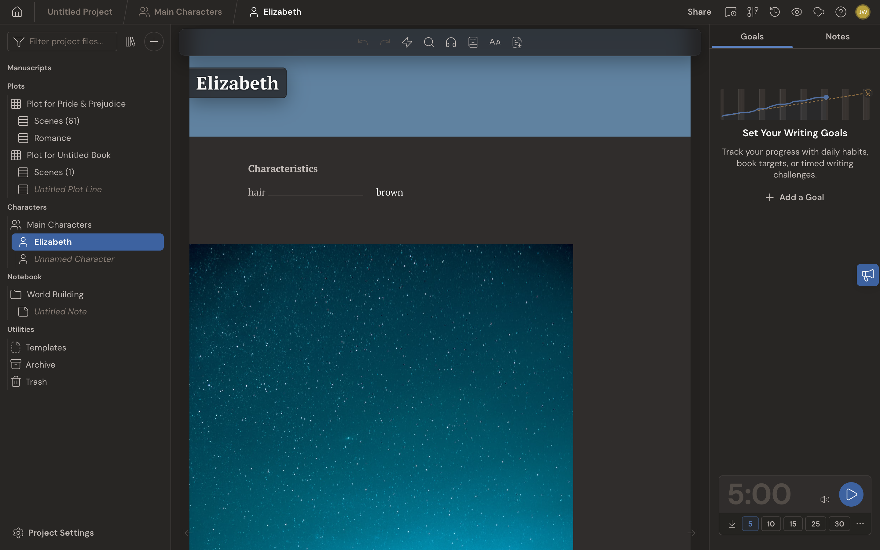
A bright white page at midnight can feel like staring into a headlight. In Dabble, you can change your Theme and Font, dark mode included, so your writing space stays easy on the eyes and suits the story.
Your Theme colors the whole app. Your Font shapes how your manuscript reads, and you set it per project. Here’s how to change each one.
We’ll cover:
- Change your theme: pick a color, then light, dark, or auto
- Match your device with Auto: let the app follow your system
- Turn on Colorblind Friendly: colors that are easier to tell apart
- Give one project its own theme: a different look for a different book
- Change your manuscript font: pick the look that fits your story
Before you begin
Section titled “Before you begin”- Your Theme is an account preference. It syncs across every device you sign in to.
- Your Font is set per project, in that project’s formatting. It changes the editor display and your exports, and it does not affect any other project.
Change your theme
Section titled “Change your theme”Two controls work together: a color Theme and a light or dark Appearance.
- Open the account menu and click Preferences.
- Go to the General tab.
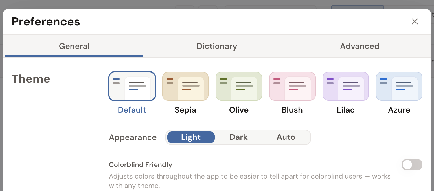
- Under Theme, click a color tile. There are six: Default, Sepia, Olive, Blush, Lilac, and Azure.
- Set the mood with the Appearance switch beside the tiles: Light, Dark, or Auto. Dark is Dabble’s dark mode; Auto follows your device.
The change applies right away.
Match your device with Auto
Section titled “Match your device with Auto”Want Dabble to follow your system? Set Appearance to Auto. Dabble then reads your device’s light or dark setting and matches it.
- Open Preferences and go to the General tab.
- In the Appearance switch, click Auto.
- Click the color tile you want. That’s the color Auto switches between: its light version by day, its dark version at night.
While Auto is on, each color tile previews both halves at once, split down the diagonal, so you can see the pair you’re choosing before you commit to it.
When your device switches to dark mode at night, Dabble follows. Prefer to lock one look? Choose Light or Dark instead.
Turn on Colorblind Friendly
Section titled “Turn on Colorblind Friendly”Dabble uses color to tell you things: a green underline for grammar, a blue one for style, red and green for success and trouble. If those colors read the same to you, they’re telling you nothing.
- Open Preferences and go to the General tab.
- Under Theme, turn on Colorblind Friendly.
It adjusts colors across the app to be easier to tell apart, and it works with any theme. Pick Lilac in Dark and keep it. Nothing about your theme choice changes.
It also gives the spelling and grammar underlines different shapes, not just different colors: spelling stays wavy, grammar turns dotted, style turns dashed. See Check spelling and grammar.
Give one project its own theme
Section titled “Give one project its own theme”Your theme normally follows you into every project. But the gothic horror wants to be dark, and the cozy mystery really doesn’t. One project can break rank.
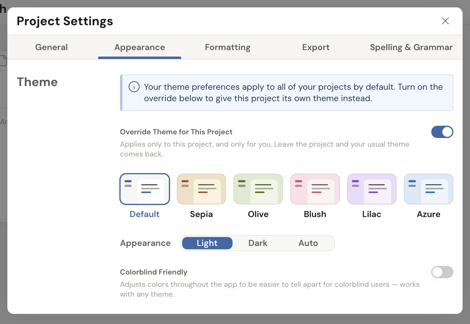
- Open the project and go to Project Settings.
- Click the Appearance tab.
- Turn on Override Theme for This Project.
- Pick a color, an Appearance, and Colorblind Friendly if you want it. The same picker, aimed at this project alone.
Two things worth knowing. It applies only while that project is open: leave it and your usual theme comes back. And it’s personal to you, so a co-author in the same shared project keeps their own theme.
Change your manuscript font
Section titled “Change your manuscript font”Your thriller and your literary novel don’t have to read alike. The font is set per project, so each story can look different on the page.
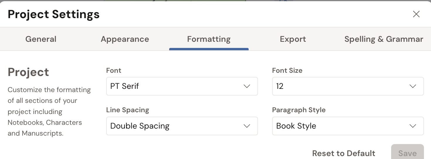
- Open the project and go to Project Settings then the Formatting panel.
- Choose a Font from the list. Dabble offers 12 options:
- General (the default)
- Romance
- Thriller
- Literary
- Screenplay
- Screenplay (Sans)
- Modern
- Sans Alt
- Dyslexic
- Traditional
- Courier
- Comic
- Your choice applies to the editor and to anything you export from this project.
The same Formatting panel also lets you adjust font size, paragraph style, and line spacing.
- The Dyslexic font uses OpenDyslexic, designed to make letters easier to tell apart.
- Sepia is a warm, paper-like middle ground if a bright white page tires your eyes but full dark feels like too much.
- Because the font lives in each project’s formatting, set it once per project. New projects start on General.